CommonBond Student Loan Application
The 2019 school year marks CommonBond’s second year lending directly to students, and it was an opportunity for the team to make major improvements in the application’s user experience and conversion efficiency.
My Role
As the Director of Product Design at CommonBond, I split my time between leading/management and working directly on a cross-functional squad contributing as a product designer. On this project I led the research, design, testing, and subsequent iterations. See significant contributors below:
Product Design - Me
Product Management - Kate Lee
Engineering - Richard Hunt, Jay Lane, Rakinur Alam, Avis Dsouza
Visual Design - Wen Ping Huang
Copywriting - Blake Soloman
Opportunities for Improvement
Poor Experience. Weak Conversion.
In 2018, CommonBond expanded into the “in-school” lending market for undergraduates, issuing new loans to students to cover the cost of attending college.
During the first year, the focus was on building out the new loan program from scratch, including all the financial, legal, operational, and technical requirements to book, certify, and disburse a compliant loan. With limited resources and time, the quality of the user experience in the application suffered, and in turn so did the conversion rate and Net Promoter Score (NPS) score for this new line of business.
The season’s start-to-finish conversion rate was 3% and the NPS score was 27.
User Research
Getting to the “Why”
During the 2018 lending peak season, we were able to gather a tremendous amount of data about what was happening in our application experience. With a primarily linear application experience, we were able to map conversion field-by-field.
Going into 2019, to supplement our quantitative understanding of “what” was happening, we leveraged a variety of qualitative research methods to better understand the “why” behind our poor conversion and low NPS, including:
Watching FullStory recordings of users engaging with the application
Remote user interviews with students, cosigners, and both together
In-person moderated usability tests of the existing application
Reviewing inbound customer support conversations
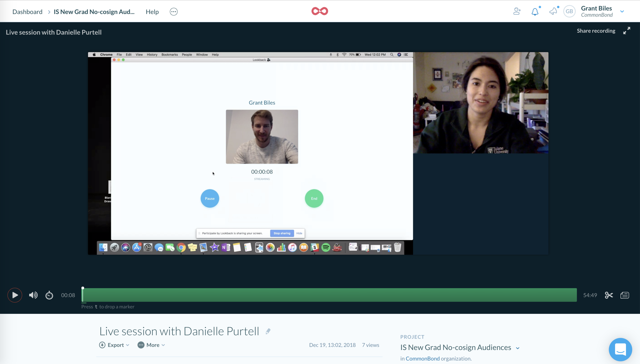
User research sessions were recorded and viewed by the full team
Designing for Both User Types
This product required both a student and the cosigner to participate in booking the loan, but our first design of the application was rigid, one-directional, and made too many assumptions about who these pairs were, who would be “leading” the process, and how they would work together to accomplish the goal of getting money for school.
Personas for our typical student and cosigner user.
Key Opportunities
In conjunction with our quantitative data, research from Marketing, insights from user research, and operational requirements, we identified the key issues customers were having with our application in 2018, and they were roughly:
Ensuring customers selected the correct product application to start
Effectively adding the second actor to the application (student or cosigner)
Acclimating new users and allowing for a more flexible progress
Acknowledging emotional component. Strive for delight.
Potential student user journey map.
Designing as a Team
Early Workshops
With clarity around our goals for the coming year and a better understanding of our opportunities for improvement, we kicked off a series of cross-functional workshops that included major contributors and stakeholders from across the business.
Workshop whiteboard (1 of 2)
Workshop whiteboard (2 of 2)
Ideating and Exploring
We spent time unpacking problems, reviewing research, sharing insights about our customers, generating ideas, producing prototypes, and ultimately getting our first round of feedback from customers with a rough paper prototype.


Display version of our paper prototype from early workshops.
Validating in the Off Season
As a seasonal business, it can be challenging to get quantitative, statistically significant feedback before the major peak season starts in June. However, there is a bump in mid-year lending during December and January, so as a team we decided to test one of our key top-of-funnel hypotheses aimed at addressing “routing” customers into the correct application experience.
Fortunately the results were positive, leading to a ~30% increase in application efficiency and a reduction of customer support tickets in this key category. This gave us a boost of confidence that we were heading in the right direction.
User flow diagram for our off peak test.
Primary Improvements
Getting Customers to the Right Place
As mentioned, one of the primary problems we witnessed for our first year customers was that they would inadvertently end up starting the wrong kind of application. This was due to a variety of factors, but ultimately we designed and built a sequential and conversational “routing” experience to gather pertinent details about the potential customer and facilitate a more tailored and accurate experience moving forward
A sampling of screens from our top-of-funnel application “routing” experience.
Adding a Second User
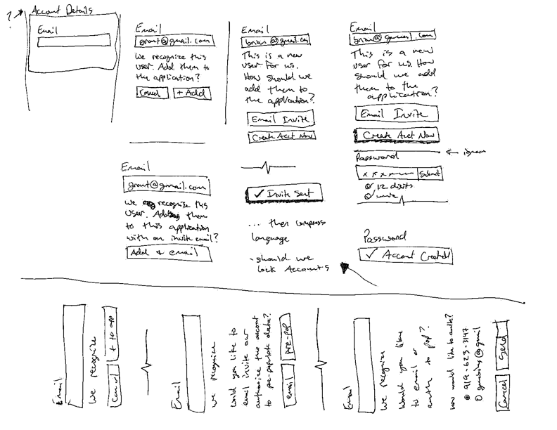
As a product requiring two users, ultimately either a cosigner or a student would need to be added to the application. Rather than requiring a cumbersome multiple session experience, we worked to facilitate a more seamless experience which introduced new users to the application, dynamically recognized existing accounts, and pre-populated data (when appropriate).
A sequence of screens illustrating the new mid-application account creation and addition.
Providing Context for a New User Mid-Application
By reducing the rigidly sequential nature of the first portion of the application, we were able to more accurately and effectively communicate progress through the application. This made the experiences less jarring for a second user who likely had very little context for the previous work that had been completed.
The application’s “hub” screen allowed for an overview of progress made and context into the work remaining.
Delight Along the Way
One of the things that came through clearly in our qualitative user research was the emotional nature of borrowing for school. The emotions were varied but were often very strong. We wanted to acknowledge that reality and provide encouragement and delight (when appropriate) throughout the process.
Congratulations gif upon completion of the loan application.
The Impact
With the updated design, interactions, and content structure we iteratively released the updated application and remeasured our key conversion metrics and found the following improvements:
The application conversion rate rose from 3% to 10%
The NPS score for this product line jumped from 27 to 71
Our booked loan volume grew by 2x year-over-year
Takeaways
This project has spanned multiple years, there’s still plenty of room for improvement, and I’ve already learned a lot along the way.
The most important lesson for me has been the value of not only doing user research and following a collaborative design process, but finding ways to effectively communicate and tell the story of how that research led to design decisions and ultimately impacted the broader business.
Telling the story of design’s value is something I’m actively working to do better, but there’s plenty of room for improvement.


